

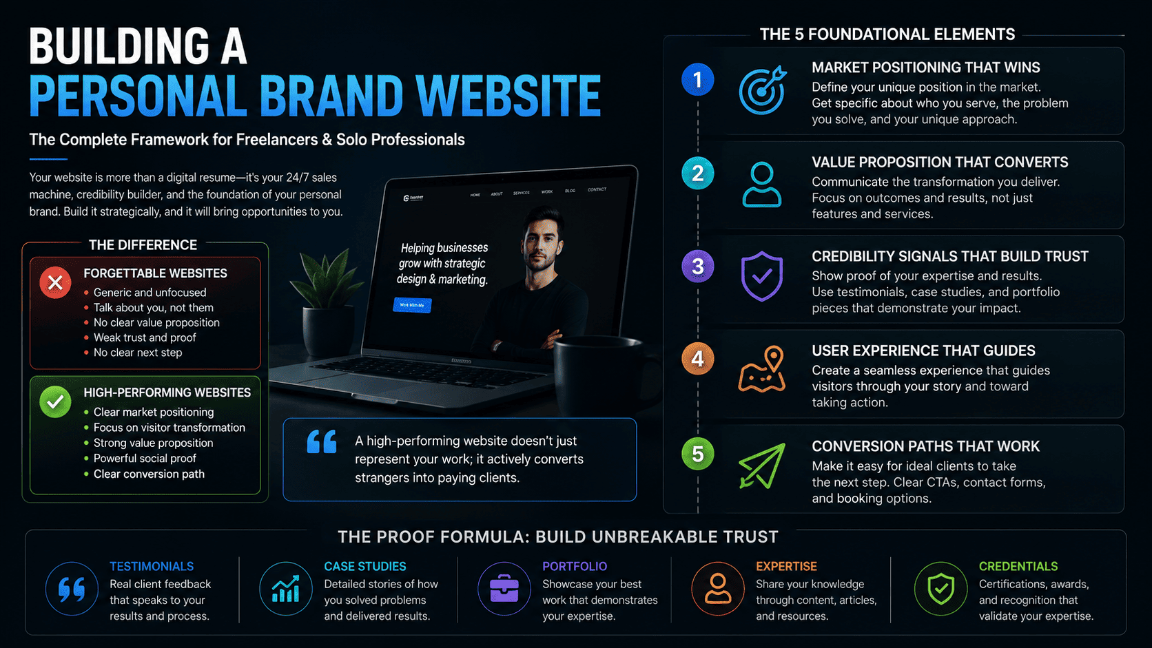
Building a Personal Brand Website: The Complete Framework for Freelancers and Solo Professionals
In an era where first impressions are digital and attention spans are measured in seconds, your personal website has become the cornerstone of your professional identity. Yet most freelancers, entrepreneurs, and solo professionals approach their websites reactively—throwing together a resume, a contact form, and calling it done.
The reality is far different. Your website is a sales tool, a credibility engine, and a reflection of your expertise all at once. When done strategically, it doesn't just represent your work; it actively converts strangers into paying clients. This comprehensive guide explores the five foundational elements that separate high-performing personal brand websites from forgettable digital afterthoughts.
The Strategic Foundation: Market Positioning That Wins
Before designing a single pixel or writing a single word, you must answer a fundamental question: What market are you actually competing in, and why should someone choose you?
This is where most personal brands fail. They describe what they do in generic terms that apply to thousands of others. A "marketing consultant" or "web designer" or "business coach" blends into the background noise. But a professional who can articulate their specific position within a defined market category becomes memorable and differentiated.
The positioning framework used by leading brand strategists begins with a simple structure: the market category you're actually competing in, whether explicitly named or not. This isn't about being clever with language—it's about identifying the actual competitive landscape where your future clients are shopping for solutions.
For example, a freelancer might describe themselves as a "content writer," but the actual market category they're competing in could be "B2B SaaS lead generation," "healthcare compliance copywriting," or "ecommerce product descriptions." Each of these categories has different buyers, different pain points, and different willingness to pay. By claiming a specific category, you instantly become the obvious choice for people in that market rather than one of many generic options.
Once you've identified your category, the next step is to articulate three attributes that make you the obvious choice specifically within that category. These aren't generic virtues like "attention to detail" or "fast turnaround." They're specific, defensible capabilities that matter to your target market.
If you're positioned in the healthcare compliance copywriting category, your three attributes might be: "experience with FDA documentation standards," "background in pharmaceutical marketing," and "certification in healthcare privacy law." These attributes are meaningful precisely because they're specific and relevant to people shopping in that market.
Your positioning statement should distill into a single, compelling sentence that captures this essence. This becomes your homepage headline, the thing visitors see immediately. Research shows that conversion rates increase dramatically when the first thing a visitor reads confirms they're in the right place.
Developing genuine positioning requires honest self-assessment. You need to identify where you have demonstrable advantage—not aspirational advantage, but real competitive edge based on your background, skills, and past work. This might come from specialized knowledge, deep experience in a specific industry vertical, or measurable results you've consistently delivered.
The key is that your positioning must be defensible. If you claim to be the obvious choice for SaaS lead generation, you should have concrete evidence: case studies showing increased qualified leads, client testimonials from SaaS founders, or data demonstrating improved conversion rates. Without this evidence, your positioning is just marketing copy.
The Narrative Arc: Writing an About Page That Actually Engages
The About page is where visitors decide whether to continue engaging with your brand or move on to a competitor. Yet most About pages read like résumé summaries: "I graduated from X, worked at Y, and now do Z."
This format fails because it doesn't create emotional connection or memorable differentiation. People don't remember lists; they remember stories. They don't connect with credentials; they connect with transformation and insight.
An effective About page is structured as a short story arc. Every story has elements: a beginning that establishes context, a turning point where something changed, and a resolution that explains where you are now and why it matters to the reader.
Consider the difference between these two approaches:
"I studied engineering at Stanford, worked at Google for five years, and now help startups scale their infrastructure. I have expertise in cloud architecture and have managed systems serving 50 million users."
"Five years into my engineering career at Google, I was maintaining systems that worked flawlessly—and felt utterly empty. I realized I was solving problems that had already been solved a hundred times. So I left to work with early-stage startups, where I discovered something unexpected: the infrastructure problems startups actually face are completely different from what I'd learned at scale. That's what drives my work now—helping founders avoid the mistakes that waste years of engineering time and millions in unnecessary infrastructure costs."
The second version does multiple things the first doesn't: it reveals personality, shows the thinking behind your choices, and most importantly, it explains why the reader should care. It establishes that you understand their specific situation because you've lived a relevant version of it.
Within your narrative arc, identify one specific detail or turning point that makes you memorable to a stranger. This is usually a moment of realization, a unconventional decision, or a specific accomplishment that illustrates your values and approach. Avoid generic achievements ("won awards") and instead focus on details that reveal something true about how you work and think.
The closing paragraph of your About page should naturally transition into inviting action. This isn't a hard sell—it's a genuine invitation for the next step. "If this resonates with how you think about marketing, let's talk about your project" or "If you're wrestling with this same problem, I'd love to hear about what you're working on" creates natural momentum toward engagement.
The entire About page should be readable in 2-3 minutes. You're not writing a biography; you're creating a compelling reason for someone to move forward in the conversation.
Building Your Proof Wall: Visual Credibility Architecture
Credibility compounds when organized strategically. Most professionals scatter proof points across their websites randomly—a testimonial here, a client logo there, a project case study somewhere else. This approach dilutes their impact.
Instead, the most effective personal brands create a dedicated credibility section, often called a "proof wall," where evidence is organized according to a clear visual hierarchy.
The principle is straightforward: your strongest proof points should lead visually and narratively. These are the pieces of evidence that your target market cares about most. For a B2B consultant, this might be quantified case studies showing revenue impact or testimonials from recognizable company names. For a designer, it's exceptional portfolio pieces that demonstrate the specific design direction clients hire you for. For a coach, it's results data from past clients.
The next layer consists of supporting proof points—things that reinforce credibility without being the primary reason someone chooses to work with you. Certifications, press mentions, speaking engagements, industry recognition, and client lists belong in this supporting layer.
The visual format matters significantly. Different proof points communicate differently:
Testimonial Cards
Client testimonials should feature a photo, name, title, company, and the specific quote. The photo and company affiliation are critical—they verify the testimonial is real, not fabricated. Research shows that testimonials with photos convert 72% better than text-only testimonials. The quote should be specific to outcomes or transformation, not generic praise.
Number Callouts
Quantified results communicate quickly and powerfully. "Increased email list growth by 340%," "Reduced customer acquisition costs from $47 to $12," or "Successfully launched 23 SaaS products" convey competence through data. These should be presented in a larger, bold typography to grab attention.
Case Study Cards
Short case studies that follow a problem-outcome-result structure demonstrate your thinking and approach. These shouldn't be long-form essays; they should be scannable, with clear sections for the challenge, your approach, and the results achieved.
Portfolio Examples
For creative professionals, portfolio pieces speak louder than any description. The key is showing finished work in context and explaining the strategic thinking behind design decisions, not just showing aesthetics.
Recognizable Markers
Client logos, publication mentions, speaking engagements at recognized conferences, or brand partnerships are quick trust signals. "Featured in Forbes," "Spoken at SXSW," or "Trusted by 50+ venture-backed startups" communicate credibility through association.
The arrangement of these proof points should flow like a persuasive argument, not a gallery. Start with your most impressive evidence, then layer in supporting points. Think of it as building a case; each piece of evidence makes the next one more credible.
Spatially, avoid cluttering everything into one overwhelming section. Instead, distribute proof points strategically: place your most compelling case study early, integrate testimonials into relevant sections of your sales narrative, show portfolio work when discussing your specific design philosophy, and place client logos and recognitions in a dedicated section.
The Contact Page That Actually Converts
Your contact page is the final conversion point. A visitor has read your positioning, engaged with your story, reviewed your proof, and is now considering reaching out. The contact page needs to remove friction, not add it.
The conventional contact page is just a form field: name, email, message. This is insufficient for three critical reasons. First, it provides no context for what happens next, leaving potential clients uncertain whether you'll actually respond. Second, it doesn't qualify inquiries, so your inbox fills with requests from people who aren't your ideal clients. Third, a form is friction; many people will abandon rather than fill it out.
An optimized contact page structure includes four elements:
Clear Value Statement
Explain exactly what you offer and for whom. "Book a strategy call to discuss how we scale content operations for B2B SaaS companies" is far more effective than "Get in touch." This immediately qualifies who should contact you.
Pre-Qualifying Question
Before they can submit contact information, ask a question that filters for intent. This might be: "What's your annual marketing budget?" for an agency, "How many team members will this project involve?" for a freelancer, or "Are you currently generating leads from your website?" for a strategist. This accomplishes multiple things—it keeps out unqualified inquiries, it makes respondents think about their real needs, and it provides you with qualification information before any conversation.
Clear Response-Time Expectation
State explicitly how fast you'll respond. "I respond to inquiries within 24 hours on business days" or "Expect a reply within 48 hours with next steps and a calendar link" sets expectations and builds trust. When people know you'll actually respond quickly, they're far more likely to reach out.
Alternative Contact Method
Some people avoid forms entirely due to privacy concerns, accessibility issues, or simple preference. Offering an email address, a direct phone number, or a link to a messaging platform gives these people a path forward. "If you prefer email, reach out directly to [email]" or "Schedule a 15-minute discovery call here" provides options.
Beyond the form itself, the contact page should briefly explain your typical process after inquiry. What happens after someone submits? Do they get an automatic response? When will they hear from you personally? Will you send calendar options? Are there any materials they should prepare? This narrative removes uncertainty and creates a sense of structure and professionalism.
Optional but effective elements include testimonials from past clients about how easy you are to work with, a FAQ addressing common questions, and a section on frequently asked services with estimated pricing ranges (if applicable). These elements continue to build confidence even on the contact page itself.
The Visual System: Creating Intentional Brand Coherence
When a visitor first lands on your website, they form an impression within milliseconds based on visual design. Before reading a single word about your qualifications, they're making judgments about your professionalism, modernity, and trustworthiness based on color, typography, and visual consistency.
This isn't about having trendy design. It's about having intentional design—where every visual choice communicates something true about your brand and creates coherence across every page.
The foundation of visual intentionality is a carefully chosen color palette. Most amateur personal brands pick colors randomly, leading to websites that feel scattered and unpolished. Instead, select exactly three colors that work together harmoniously and that communicate something about your brand personality.
The three-color system should typically include:
A Primary Color
This is the dominant color used for headlines, buttons, and key UI elements. It should be distinct and memorable. Choose this based on what emotional and professional impression you want to make. Tech-forward professionals often choose deep blues or sophisticated blacks. Creative professionals might choose more saturated colors. The key is that the color should feel intentional, not arbitrary.
A Secondary Color
This complements the primary and is used for accents, hover states, and supporting elements. The secondary color should have enough contrast with the primary to create visual interest without clashing. Consider the color wheel relationships—complementary colors (opposite on the wheel) create vibrant contrast; analogous colors (adjacent on the wheel) create harmony.
A Neutral Background Color
This is typically off-white, warm white, or a subtle gray. This color should make your primary color pop and ensure text remains highly readable. Avoid pure white (#FFFFFF) which can feel sterile; instead use slightly off-white tones like #F9F7F4 or #FAFBFC that feel warmer and more sophisticated.
Font pairing is equally critical. Your typography makes a powerful statement about your professionalism. The optimal system uses exactly two fonts: one for headings and one for body text.
For headings, choose a typeface that has personality and matches your brand. This might be a bold geometric sans-serif like Montserrat for a tech-forward brand, an elegant serif like Playfair Display for a luxury positioning, or a friendly sans-serif like Inter for an approachable, modern feel. The heading font should be distinctive enough to be memorable but legible enough to remain readable even when scaled down.
For body text, choose a highly legible sans-serif or serif designed specifically for screen reading. Fonts like Inter, Roboto, System UI, or Segoe UI are engineered for excellent readability across all devices and screen sizes. Body text should be neutral enough not to compete with your heading font but professional enough to convey quality.
The critical test: at the actual size you'll use on your website, does the combination read as intentional and professional? View it across devices—phone, tablet, desktop. Does the hierarchy feel clear? Can you comfortably read body text for extended periods?
Finally, identify a single recurring visual element that appears on every page to tie your brand together. This might be:
- A specific shape: Perhaps rounded corners throughout, or a geometric shape used as an accent. One luxury brand uses a thin horizontal line as a divider on every page; another creative agency uses circles as background elements consistently.
- A specific line style: Maybe all icons use a 2-pixel stroke weight, or all dividing lines use a specific dashed pattern.
- An icon set: Using a consistent icon style throughout creates visual coherence. If you use icons for feature callouts or service categories, ensure they all come from the same design system—same stroke weight, same style (filled vs. outline), same visual complexity.
- A pattern or texture: Some brands incorporate a subtle background pattern, a specific texture treatment, or a geometric pattern that appears throughout.
This recurring element should be used consistently enough that when someone sees it, they immediately know they're in your digital space. This reinforces brand recognition and creates a sense of intentional design rather than random aesthetics.
Bringing It All Together: Implementation and Testing
These five elements—positioning, narrative, credibility, conversion, and visual design—work together as a system. Each reinforces the others. Your positioning informs what proof points matter most. Your visual system makes your proof points more impactful. Your About page narrative sets up the credibility section. Your contact page closes the loop.
Implementation requires clarity and prioritization. Start with positioning—if you haven't clarified your market category and competitive advantage, the other elements will lack foundation. Then develop your narrative and proof points. These are content-heavy and require deep thinking. Once these are solid, design the visual system that brings them to life. Finally, architect your contact page as the conversion engine.
Testing is critical. After launch, monitor where visitors are dropping off. Are they leaving after the homepage? Then your positioning isn't resonating or your visual design isn't credible enough. Are they reading your About page but not exploring your services? Then your narrative isn't compelling enough or doesn't transition smoothly into your offerings. Are they exploring your proof wall but not contacting you? Then your contact page has friction or the call-to-action isn't clear.
Small iterations compound. A 10% improvement in positioning clarity might increase inquiries by 15% because more qualified people recognize they're in the right place. A better-organized proof wall might increase conversion by 20% because credibility is more obvious. These compounds multiply across your website.
The Future of Personal Branding: Emerging Considerations
As the digital landscape evolves, several trends are reshaping personal brand websites. First, authenticity is becoming an increasingly competitive differentiator. Generic, polished perfection signals artificiality; real personality and acknowledging imperfection builds connection. This doesn't mean unprofessional—it means showing your genuine perspective rather than a curated persona.
Second, video is becoming table stakes for premium personal brands. A 30-second video explaining your positioning or a 2-minute overview of your work process can convert visitors far more effectively than text alone. This doesn't require expensive production; authentic, well-lit video filmed on a smartphone often outperforms highly produced content.
Third, email capture is becoming more valuable than ever. Your website brings traffic, but email enables ongoing relationship-building. Offering a valuable lead magnet (a specific resource, guide, or tool) in exchange for email builds an audience you can reach repeatedly, reducing dependency on search traffic or social referrals.
Fourth, AI-assisted personalization is emerging as a viable option for scaling. Rather than generic landing pages, some sophisticated personal brands are using AI to personalize content based on visitor behavior, traffic source, or profile data. A visitor from a SaaS company might see slightly different positioning than one from a service agency, for example.
Conclusion: Your Website as Your Most Important Business Asset
Your personal brand website is not a vanity project or a box to check. It's your most cost-effective sales channel, operating 24/7 to attract, convince, and convert potential clients.
When these five elements are aligned—clear positioning that defines your market and competitive advantage, a narrative that creates emotional connection and memorability, credibility organized and presented strategically, a contact process that removes friction, and a visual system that communicates professionalism and intention—your website becomes a powerful business engine.
Implementing this framework requires honest self-assessment, strategic thinking about what makes you genuinely different, and disciplined attention to how every element of your website serves your actual business goals rather than just looking good.
The professionals who do this well don't see their website as a digital resume. They see it as their best sales representative, working continuously to attract ideal clients, build credibility quickly, and make it effortlessly easy for the right people to say yes to working together. That's the power of a strategically designed personal brand website.